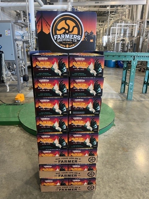
GRAPHIC DESIGN TIPS FOR POINT OF SALE DISPLAYS
VISUAL HEIRARCHY AND GRAPHIC DESIGN
Last time we talked about choosing the right type of display for your product in a retail store. Just as critical as the right retail display is getting your graphic design right. There are two important things your graphics must do:
1. STAND OUT FROM THE CROWD. With thousands of products vying for your customer’s eyeballs, your graphics have to attract their attention.
2. TELL YOUR STORY in a way that is meaningful to your customers.
No doubt you have agonized over product messaging, but have you considered your VISUAL HIERARCHY?

Here are a few research-based rules for designing graphics for displays*.
A. Limit your messages – use just a few salient benefits that best tell your customer why they need this product. 5 to 7 words are considered the optimal length. Shoppers today come into the store with far more pre-purchase information than ever before, so you don’t need to talk about every product feature in your display. Keep your message succinct, but
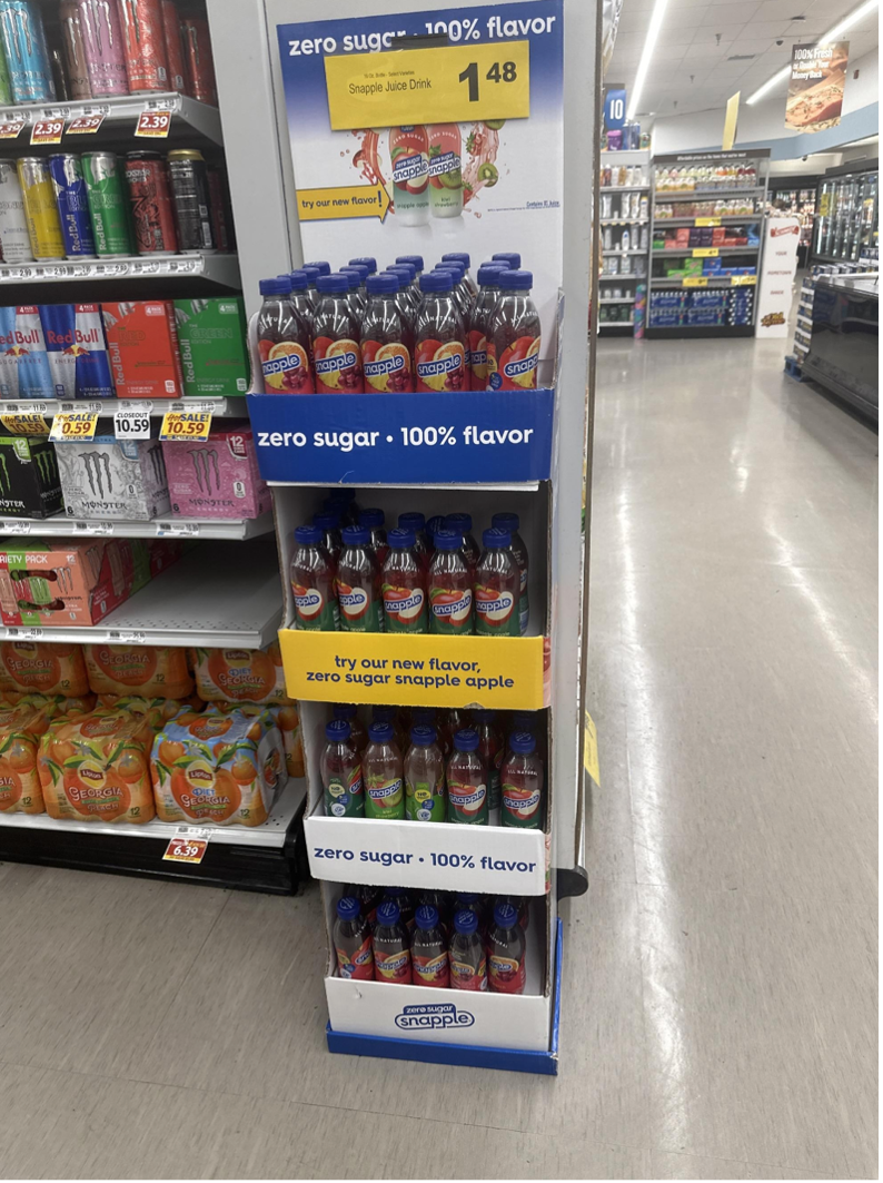
In this example, key images are hidden by the retailer’s price label. While it showcases product features, it also makes the key mistake of hiding the branding at the bottom, where it’s virtually invisible to shoppers.
C. Lifestyle imagery – pictures of people connect your customers with your product and are proven to be more attractive to shoppers.
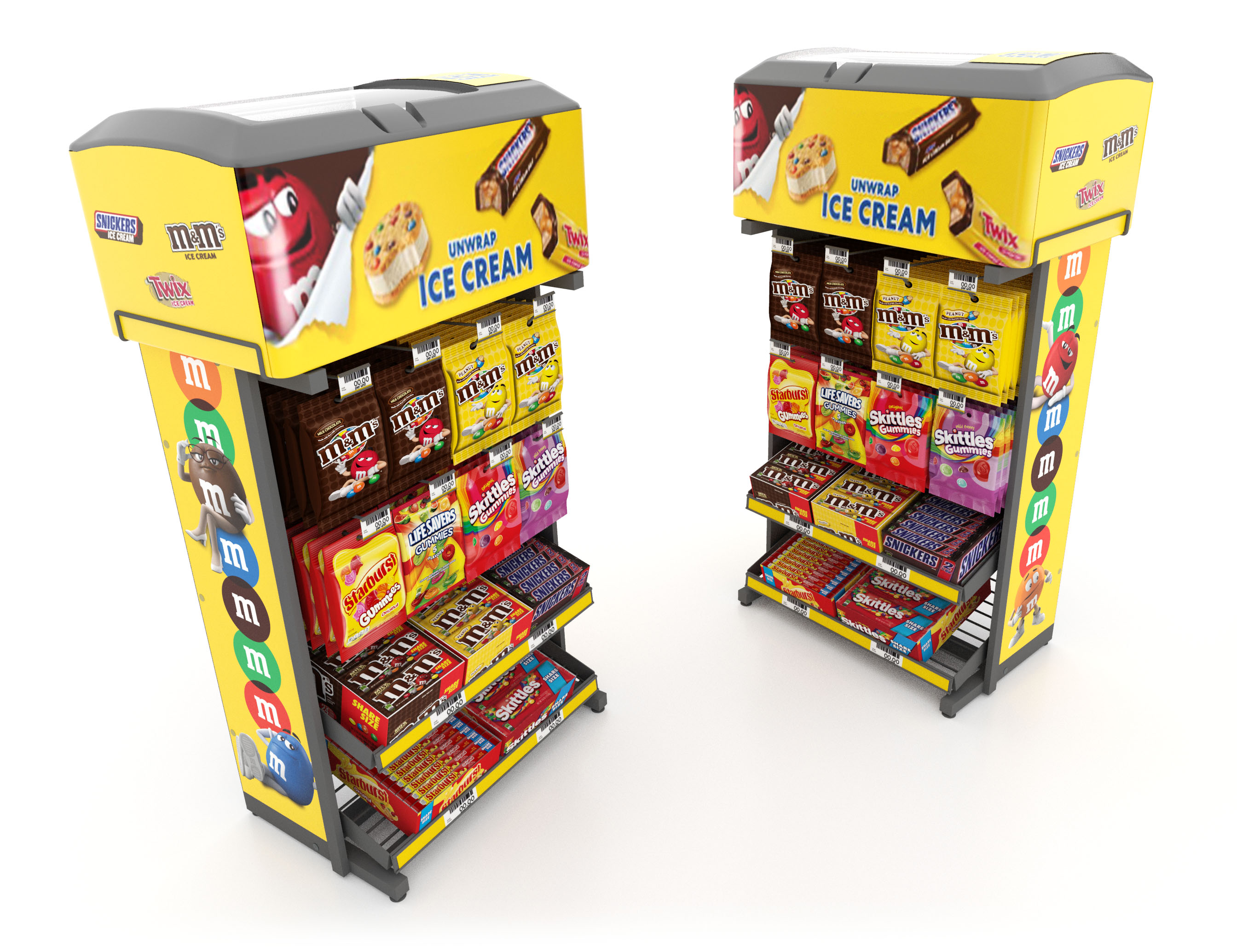
F. Keep your most important message at eye-level – generally speaking, that’s on the display header. Make key messages bigger. Design standards suggest that headlines should be 3 times larger than body text.
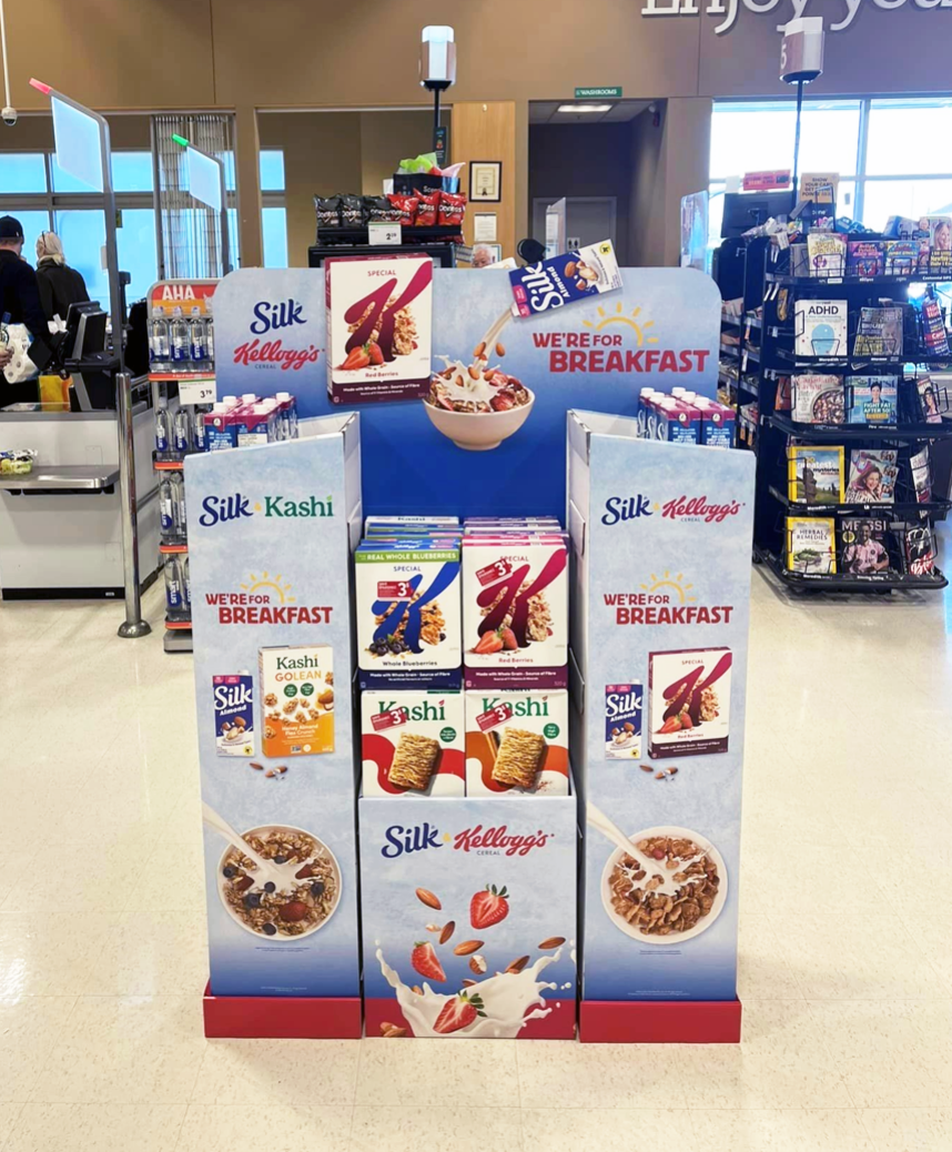
The display above is a great example of both principles E and F. with the key message right at eye level and the product shown in an eye-catching and appetizing way.
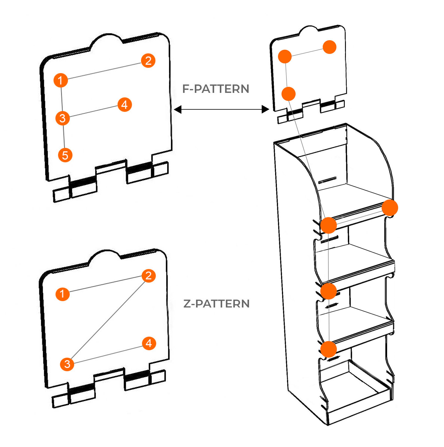
G. Organize your messaging in a pattern that is natural for readers – customers generally scan in one of two shapes, “F” and “Z”, so take advantage of this in your design. Below you can see what this might look like on a display header, but you can apply this rule to the side panels or the front of the display and include the shelf strips as part of the overall pattern.
*Source: The Central Group Design Fundamentals Research, copyright 2021.
Need Help?
Why not start by searching our FAQs. If you can't find the answer you need there, one of our packaging and display experts will be happy to assist.
